Ideas for Colour combining
There are colour combinations that we stumble upon that feel fresh and new, totally different to anything we’ve seen for a while. Often we discover them in a single painting in an exhibition – recently, for instance, Georgia O’Keeffe, Winifred Knights and Etel Adnan left us with plenty of ideas. Sometimes we’re struck by a colour scheme in a shop, restaurant or hotel and other times it can be in a film, an outfit or a friend’s house.
In our homes, of course it’s possible to try out these ideas. Most radically, starting again with a colour scheme and making the biggest and most immediate impact by changing the paint colour on our walls. But there are smaller, easier ways to try out new colours too – by introducing a new tablecloth to your dining table, adding a vase, cushion or rug to a particular corner of a room, or changing the pillow slips on your bed to bring a fresh accent colour to your bedroom. However you like to do things, below are three ideas for colour combining along with some of the newest rugs in our collection that pick up on the shades…
Brown and rust
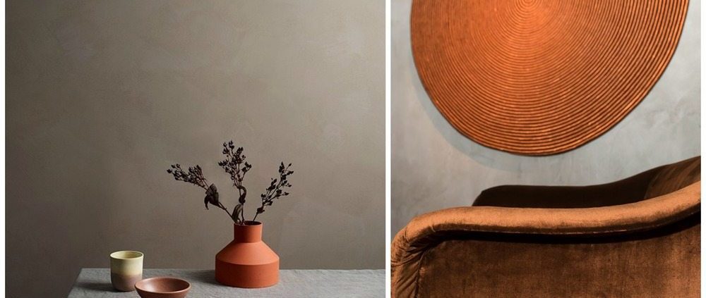
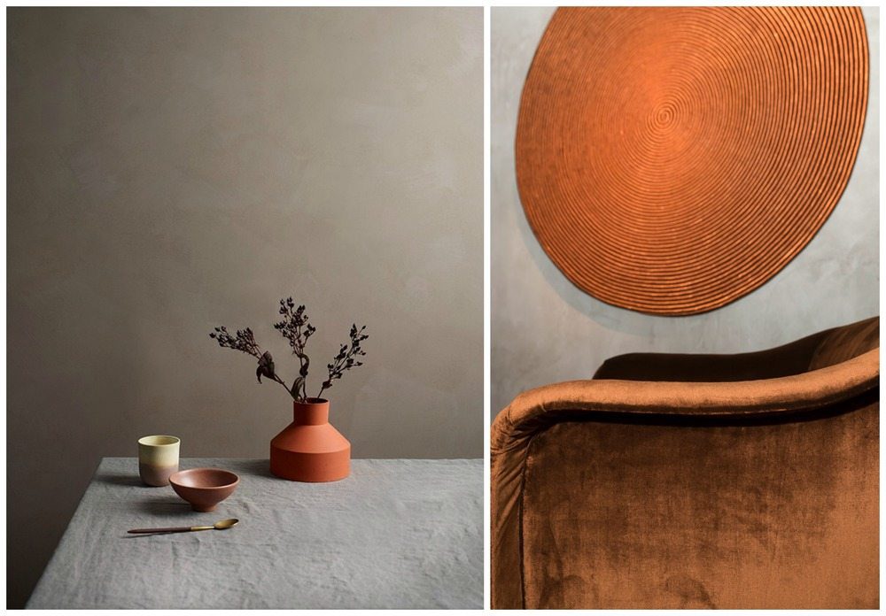 Images left, Jotun paint Lady Minerals Right, Dedar at Nilufar Gallery
Brown was a bit unfashionable for a while, but we’ve spotted it creeping back into interiors which suits us well, since so many of our rugs have a brown-ish base note. It’s the muted grey-brown shades that we’re drawn to and which work so well for layering colour, pattern and texture on top. The rust shade we love on top of this is, for want of a better way to describe it – very expensive looking! Add a bright pop orange and it’d have a totally different effect, not worse, just different. Muted orange shades fit with the tonal quality of the browns in this mood board and we think it feels quite exotic, almost Moroccan, but would also be very workable in north-facing rooms that need warming up.
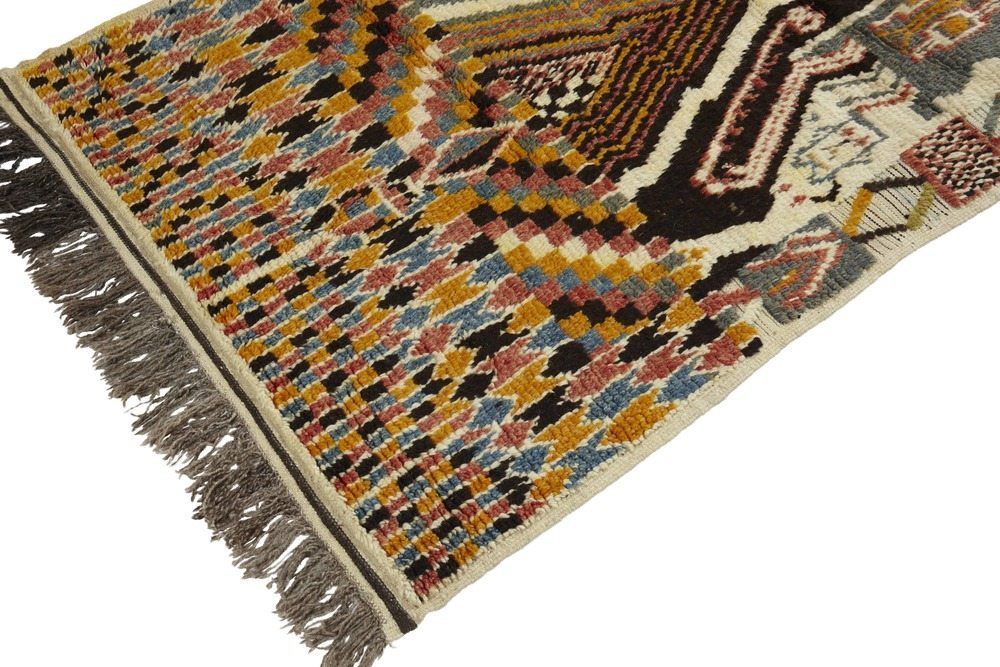 Moroccan Azilal Pile Rug
 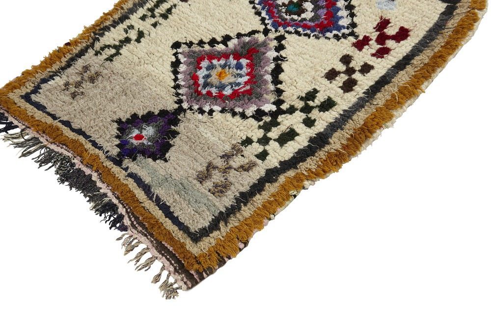 Small Moroccan Vintage Azilal Rug
 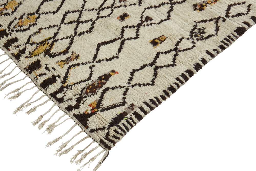 Moroccan Vintage Azilal Rug
shades of Blue on blue (with graphic accents)
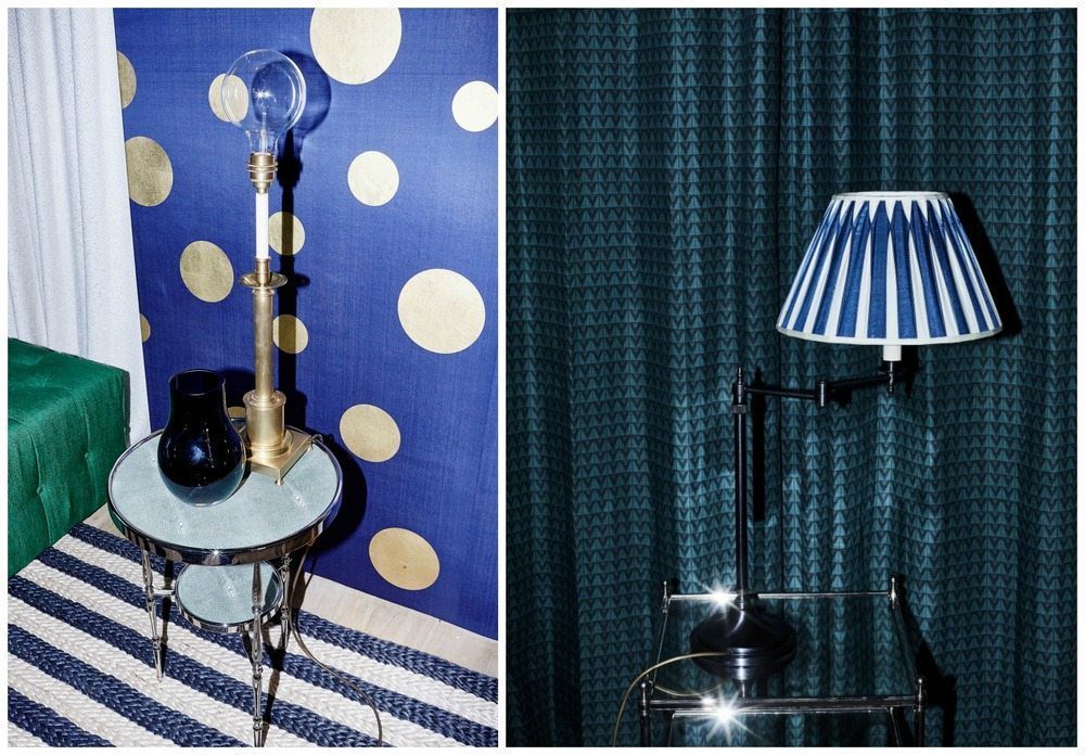 Images from Tapet Cafe
Blue is the colour of summer holidays in Santorini or Sidi Bou Said, both of which are famous for their white buildings with dinstinctive blue roofs, shutters and doors. Spend five minutes on Instagram and you’ll see what we mean…
Blue indoors feels quite different, especially in this mood board, which is about offsetting bold primary blue with softer shades of blue – navy and teal, notably. Copy this look by juxtaposing prints and making sure you have a strong graphic pattern present, such as the polka dot, the stripe, the chevron. Many of our Berber rugs feature the distinctive diamond motif that would achieve a similar effect, especially if placed alongside another statement-making print.
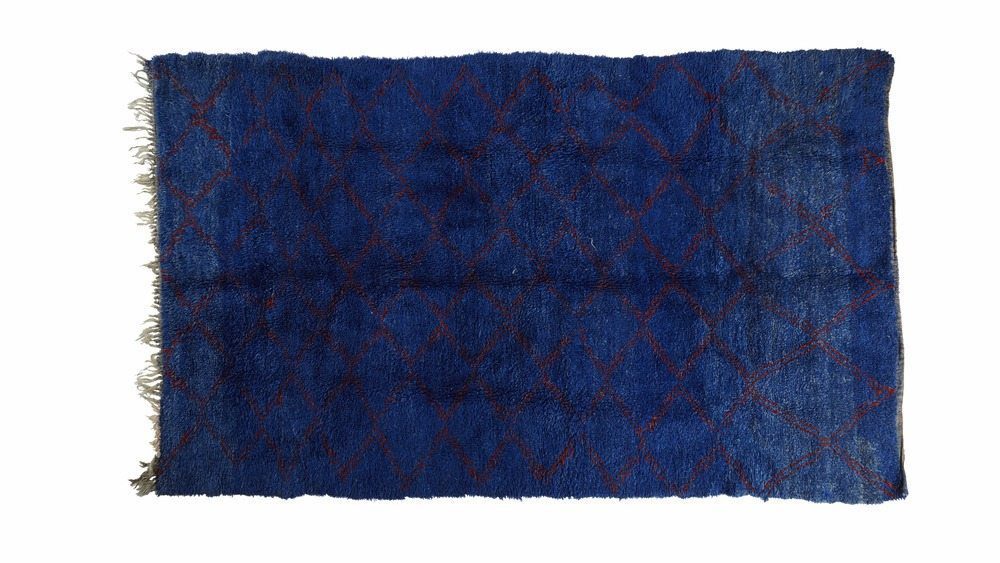 Vintage Moroccan Beni M’guild Pile Rug
 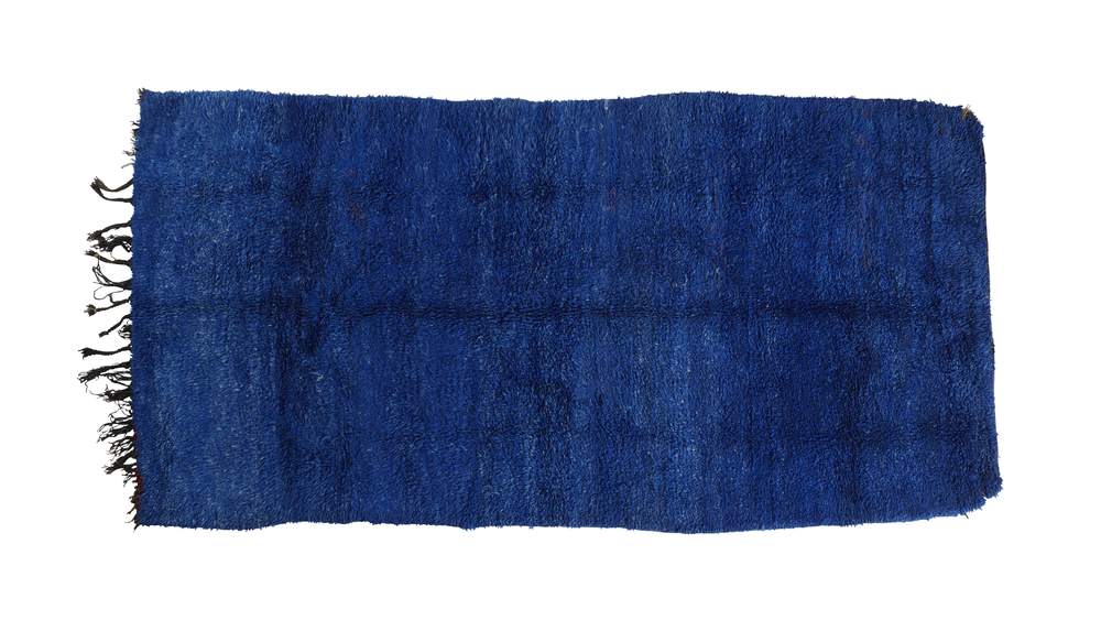 Vintage Moroccan Beni M’guild Pile Rug
 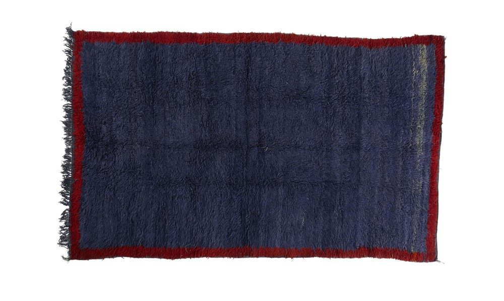 Vintage Moroccan Beni M’guild Pile Rug
 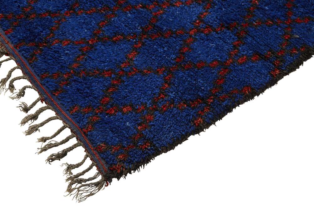 Vintage Moroccan Beni M’guild Pile Rug
 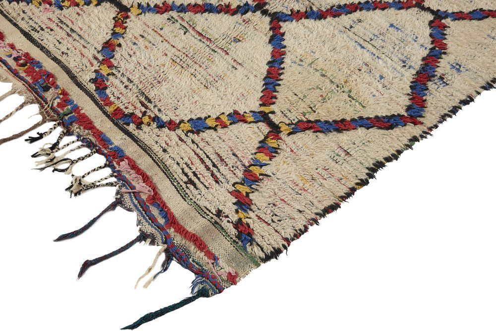 Primary colours Azilal Rug
Pink and Green
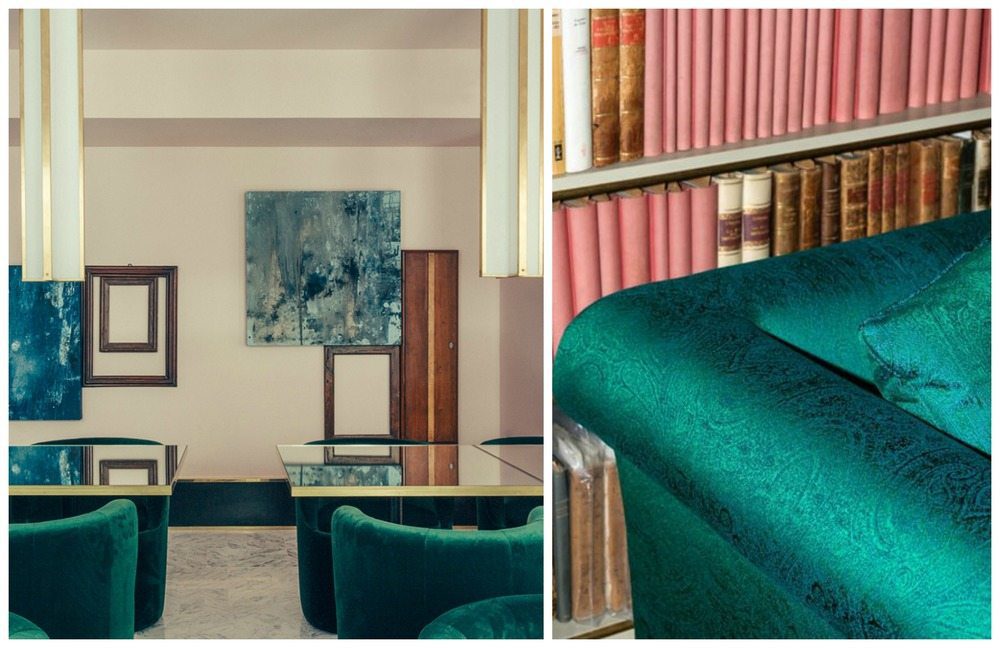 Images left, Le Saint Marc hotel by Dimore Studio, Right Dedar’s Paisley fabric, PÀISLIG.
Green and pink, has been a trend and for some time now. The pinks are often faded blush tones that look particularly swish paired with emerald greens. Farrow & Ball’s Pink Ground paint is a very popular base colour, verging on being pinky-skin toned and basically quite neutral. It also works really nicely with the brown and rust colours of our first suggested combination. One of our rugs combines these shades altogether, but if you want to use our rugs to add a single colour or family of tones then go for one of our faded red or pink carpets. Team with velvet or linen upholstery or curtains for an on-trend vibe that we think is quite timeless – and if you do have a collection of pink books, as per the Dedar idea above then make sure you show them off as a collection as they have.
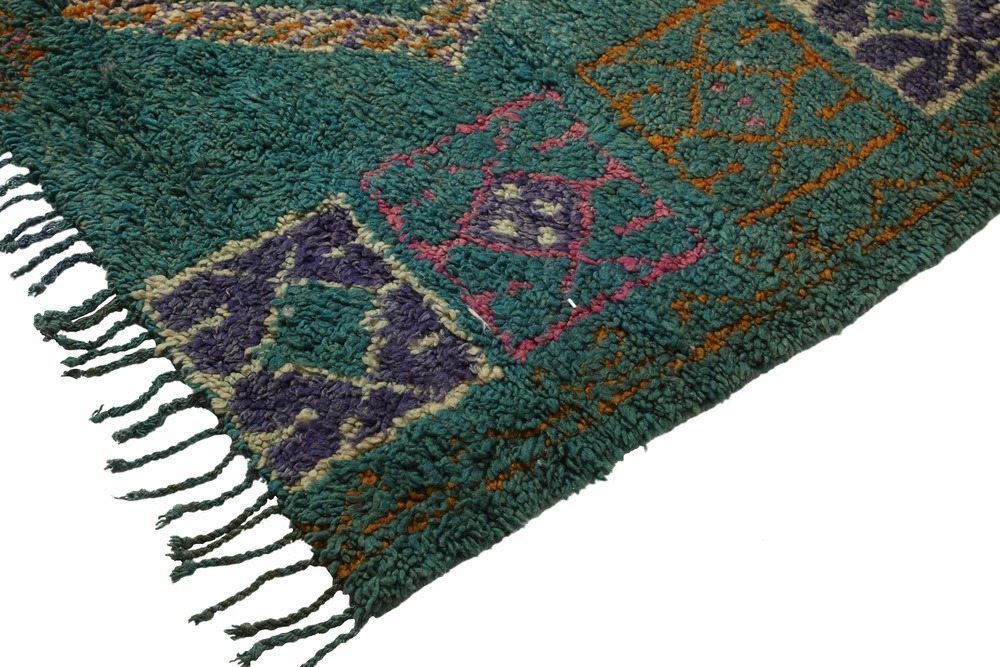 Emerald green and pink vintage Moroccan pile rug
 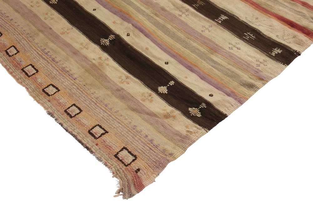 Vintage Moroccan Flat Weave Rug
 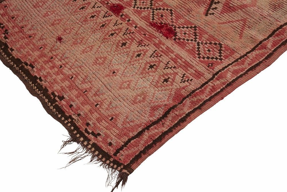 Vintage Blush Pink Moroccan Rug
 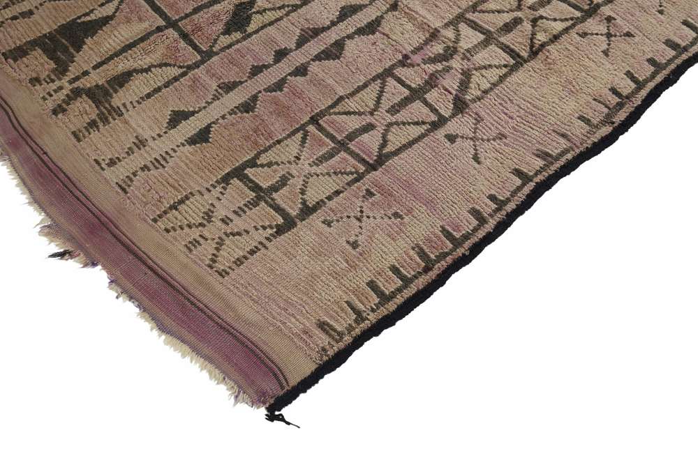 Vintage Moroccan Rug

Leave a Reply
Want to join the discussion?Feel free to contribute!